Radio Group Field
Table of Contents
This is an advanced-use feature, and likely not something you'll need to configure. What you probably want is the content types reference!
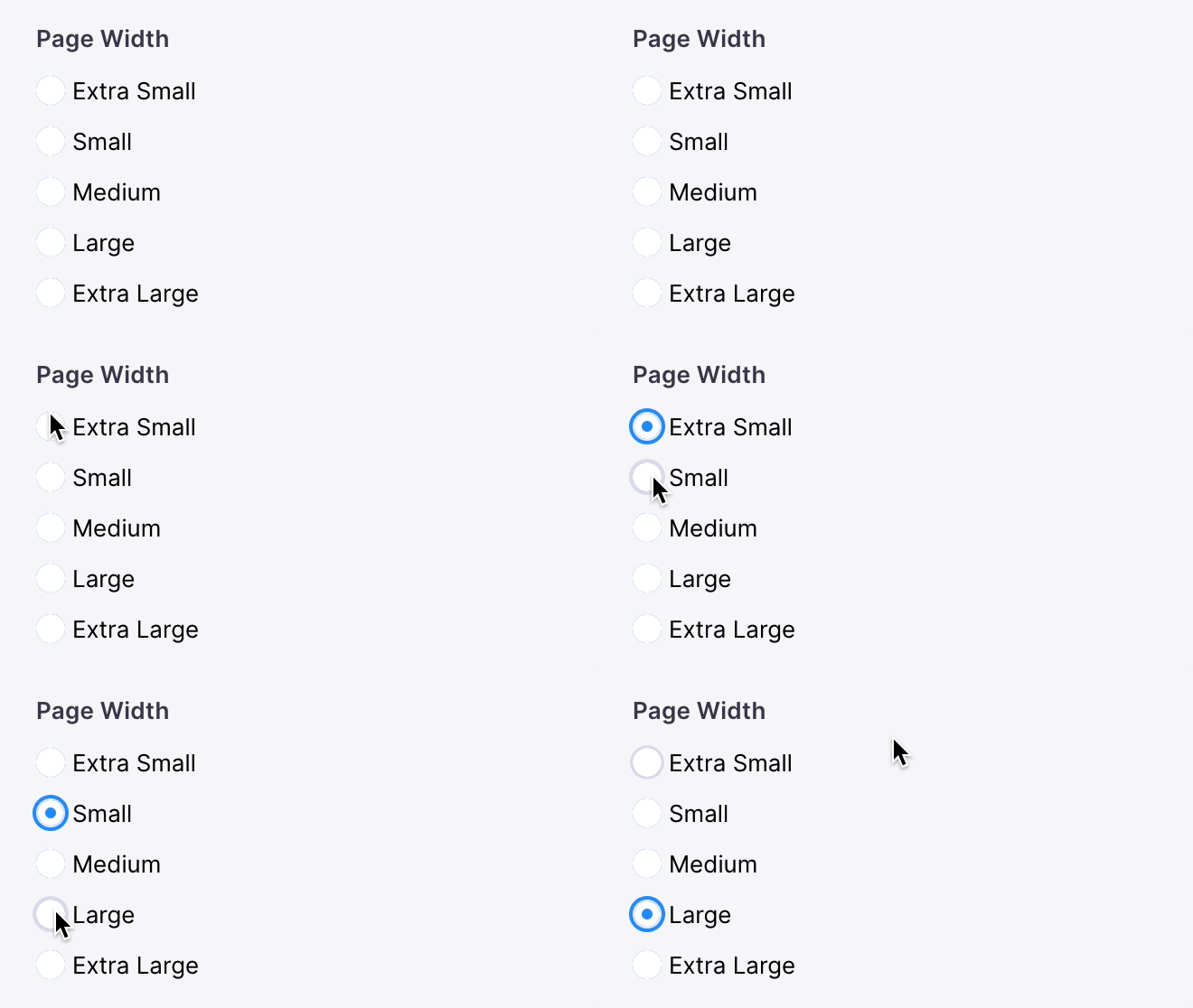
The radio-group field represents a group of radio inputs. It can rendered in a "horizontal" or "vertical" direction.


Options
interface RadioGroupField {name: stringcomponent: stringlabel?: stringoptions: (Option | string)[]direction?: 'horizontal' | 'vertical'}type Option = {value: stringlabel: string}
These interfaces only show the keys unique to the radio group field. Visit the Field Config docs for a complete list of options.
Example: Select an Rating
Below is an example of how a radio group field could be used to choose a rating of a customer review.
const ReviewForm = {fields: [{type: 'string',name: 'rating',label: 'Rating',description: 'Choose a rating for this review',options: [{ label: '★', value: 'one_star' },{ label: '★★', value: 'two_star' },{ label: '★★★', value: 'three_star' },{ label: '★★★★', value: 'four_star' },{ label: '★★★★★', value: 'five_star' },],ui: {component: 'radio-group',direction: 'vertical',},},// ...],}
Comparisons
© TinaCMS 2019–2024